
Choosing the sales dashboard displays four panels of data - Pipeline, Billings forecast, Targets & orders, Average spend by sector, Hours sold. All five sales dashboards can be set to show data for the entire company, jobs that are in your handler team, jobs where you are the handler, or jobs in another handler team. The filter settings are controlled by user permissions, you may not have access to all of these.
If you use revenue management you can switch between invoiced and recognised amounts on all the sales dashboards.
Pipeline.
This dashboard can show up to three series of financial data - net margin, gross margin, quoted value, or a single series showing the number of opportunities in your current sales pipeline. These data series can be grouped by either opportunity stage or rating, and the display can be toggled between a barchart and a funnel view. The current sales pipeline is defined as being all opportunities not flagged as complete or as final invoiced. Completing or final invoicing an opportunity will remove it from your pipeline, as will updating the status of the job to live (or on hold, in-house or special). You can also toggle between a weighted and unweighted view of the financial series. Using the weighted view takes the opportunity % weighting figure into account as set on the sales info tab of an opportunity.
Billings forecast.
This dashboard has two views which switch between showing Planned vs Invoiced and Planned GP vs Actual GP. The data series are shown per month, you can set the number of months and start month from the controls at the top of this dashboard. Planned values come from your billing plan data, invoiced / actual gp uses the same data as the financial summary dashboard. Ticking the box to include targets adds a third data series for target turnover or target gp. These targets are set up for each client, per month or per year (spread evenly).
Targets & orders.
This dashboard is presented in the form of a table listing account handlers, along with target value vs actual performance. Each client in your database can be assigned a default handler. This dashboard summarises the selected data by the client default handler. The value to compare with its corresponding target can be switched between turnover, net margin and gross margin. The selection of data used is governed by the period set in this dashboard, and the promoted / invoiced toggle to the right of the period and data series controls. Setting the dashboard to use promoted means that all opportunities promoted to live in that period are included, and the financial values displayed are based on quoted price and estimated costs - these are "whole job" values. Setting the dashboard to use invoiced means that the selection of data is based on actual sales invoices in the period and uses ticked off costs to establish net and gross margin. The target value displayed is unaffected by the choice of promoted / invoiced, that is an attribute of the selection of clients for each handler displayed.
Hours sold.
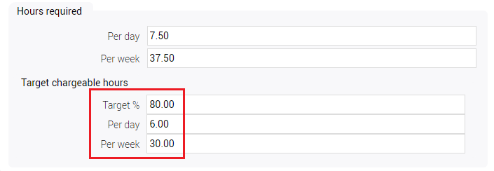
This dashboard compares available hours against hours sold. Available hours is based on your staff resources database - each staff resource will have a value for target chargeable hours set:
If they also have a default charge code set you can display availability by charge code, based on the staff defaults. Hours sold is based on estimated hours on opportunities promoted / made live in the period. The date range used to gather data is set by specifying a number of months and a start month. The dashboard has three different displays. The first is to show a monthly average for the two series of data for the entire period - basically take the total available and sold hours and divide it by the number of months. Unchecking the period average control shows the actual values for each month in the date range. You can also drill into the period average figure to show how this average is spread across all estimated charge codes.
Average spend by sector
This dashboard simply shows rolling average value for the number of months you choose in the dropdown. The amounts are rolled up by the client market sector and displayed as a bar chart. You can also toggle between monetary values and a percentage of total by sector.
0 Comments